In this article
GIFs are not just for memes or messaging apps anymore. Companies like Slack, Invision, GitHub and others are increasingly using GIFs to showcase their user experience, improve their documentation, highlight new features or even demonstrate how to use their software or app.
At Banana Accounting, we pride ourselves in having built a truly easy-to-use and fast software solution for keeping your books. We wanted to show this on our various channels while at the same time teach our audience how to use our software. From all the options we considered, designing a GIF animation seemed best. GIFs are fast-moving, fun and engaging, and offer many possibilities, despite their limitations.
The UX problem of GIFs (and how to solve it)
However, when we started imagining the final user experience of the animation, we noticed a UX issue we had not considered. The problem of “Visibility of system status”, as explained by Jakob Nielsen in his 10 usability heuristics:
The system should always keep users informed about what is going on, through appropriate feedback within reasonable time.
In other words, users should know what’s going on when interacting with your website or software. A great example of this is the swoosh sound when a tweet is being posted or the keyboard sound when someone is typing in Messenger.
How does this relate to GIFs? When you are scrolling on a webpage and come across a GIF animation, you typically don’t know where you are at in the timeline of the animation. This is of course not a problem when it comes to memes or cat GIFs. But when presenting a new feature or in a tutorial GIF, this can be quite frustrating. This is true of many software GIF animations you see online. You don’t have a sense of when it starts and end up having to watch the animation over and over.
An unusual solution
To solve this problem we decided to do something completely unusual for a GIF: add a progress bar.
Progress bars are used everywhere on websites, forms, interfaces and even on videos. They give users a sense of what is happening and something to look forward to. It’s a simple but game-changing hack. You can even combine the progress bar with your presentation’s steps to minimise visual real estate and keep your animation less cluttered.
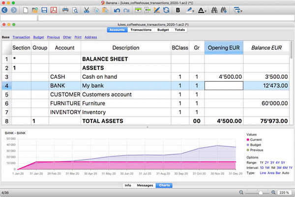
And here’s our finished animation.
You may have noticed that the progress bar is not in its usual place (at the bottom) but is above the software footage. At first, this probably seems odd. But this design choice comes from feedback we received during user tests. Users had a hard time focusing on the software presentation when the progress bar was at the bottom. Their eyes kept moving from top to bottom, as if distracted by the progress bar.
We placed the progress bar on top and voilà, the feedback was positive.
In this way the animation’s elements follow the conventional reading order, top to bottom, left to right:
- The title, fixed at the top, is the first thing users see, informing them of the subject of the animation, no matter where they are in the progression of the timeline.
- Right under the title is the progress bar, giving users the sense of where they are in the overall sequence.
- Below the progress bar, the description of the present step in the sequence.
- And finally at the bottom, we find the software footage and visuals.
But why GIFs and not video?
But why design a GIF? Why not make a video instead (and solve the progress bar problem)? Here are a few points we considered when we opted for the GIF animation:
- Unlike a YouTube or Vimeo video, there’s no need to tap or click play.
- GIFs are supported by effectively all browsers, unlike many video formats and players.
- GIFs have lower audience expectations. They’re grainy, low-resolution and short.
- GIFs are silent. Videos on the other hand require audio work, background music or a voiceover.
- Lastly, GIFs are perpetually looping. If your GIFs are well designed, your audience could be watching them over and over, giving attention to your animation.
Ready to make your own? Here are some of things we’ve learned in our process.
To get started you need these three things: a clear and compelling message, brand and software visuals, and the right tools.
The message
Keep your message concise and short and carefully plan your content accordingly, breaking the story for your animation into separate shots.
Ask yourself: will my audience perceive the message that I’m trying to convey? What is the one thing that I want my audience to catch? Will my audience understand everything I’m trying to communicate in this short animation?
When crafting your message, keep the clock in mind. The average GIF is usually under 10 seconds. Software or app GIFs tend to be longer, spanning up to 25 seconds.
For our animation, we knew 15 seconds, though very short, would be enough. Our audience, even those with a bare minimum knowledge of accounting, is already familiar with most of our workflow, because it is based on the basics of accounting itself — set up an accounting plan and enter transactions.
This is different when explaining an entirely new workflow. In this case you have to plan for a longer GIF and it might not even be possible to explain it in a short amount of time.


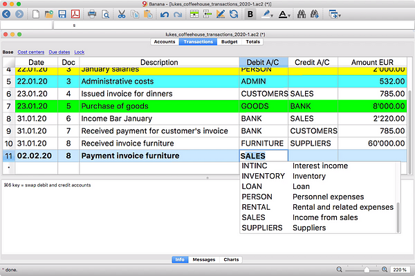
Different shots for Banana Accounting’s Accounting in 3 steps GIF
The visuals
GIFs are inherently silent and rely solely on visuals to communicate to the audience.
Here are some tips to support your message with compelling visuals:
- Be selective about your use of colors. This will allow you to make longer, more engaging GIFs that are still small in file size. Make sure to use your brand’s color palette.
- Make your software screenshots legible and when necessary zoom in on the interface and text elements.
- Use typography to highlight your message only when needed. Remove the unnecessary captions or tooltips.
- Make your animation smoother by using motion blur when possible.
The tools
There are several options to capture your software’s footage.
Mac users can use Quicktime player’s screen recording feature, the new MacOS Mojave screenshot toolbar or ScreenFlow.
Windows users can use the well hidden, built-in screen recorder in the X-box App. Alternatively, you can use screen recorder and streaming tool OBS Studio.
Once you’ve captured your software’s footage, it’s time to start putting all the elements together and create your animation. There are many ways to come at this, but I’ve found the most effective way to be starting with a video. To do this use the tool you are most comfortable with.
Once you’ve created your animation as a video, you can easily export it as a GIF.
Exporting the GIF
The main thing you want to keep in mind at this stage is the problem of file size. Check out the latest social media file size requirements and keep your files light on your website.
File size too big? Here are some things you can work on:
- Reduce your canvas dimensions.
- Tweak your color settings and watch your file size vary. Try to get the lowest file size possible without compromising too much on the quality.
- Adjust the dithering. I admittedly had no clue what dithering was until I started seriously working with GIFs. Dithering is the process by which computers create the illusion of color depth in images with a limited color palette — such as GIFs, which have a maximum of 256 colors.
- Use lossy compression and get your GIF file size even lower.
Make your own
Why not try it out? Make an easy-to-understand, compelling and short display of your software. If well-designed, a GIF can be a fun and engaging way to reach your users.
About the author
Timo Anzalone is a graphic designer at banana.ch
